
UX Design Institute
Fresh Air
A conceptual airline brand, developed as part of my course work for the Professional Diploma in UX Design with the UX Design Institute. The goal of this project was to design a user-centered website experience that simplifies flight discovery and booking, reduces friction, and aligns with how real users think and behave when planning air travel.
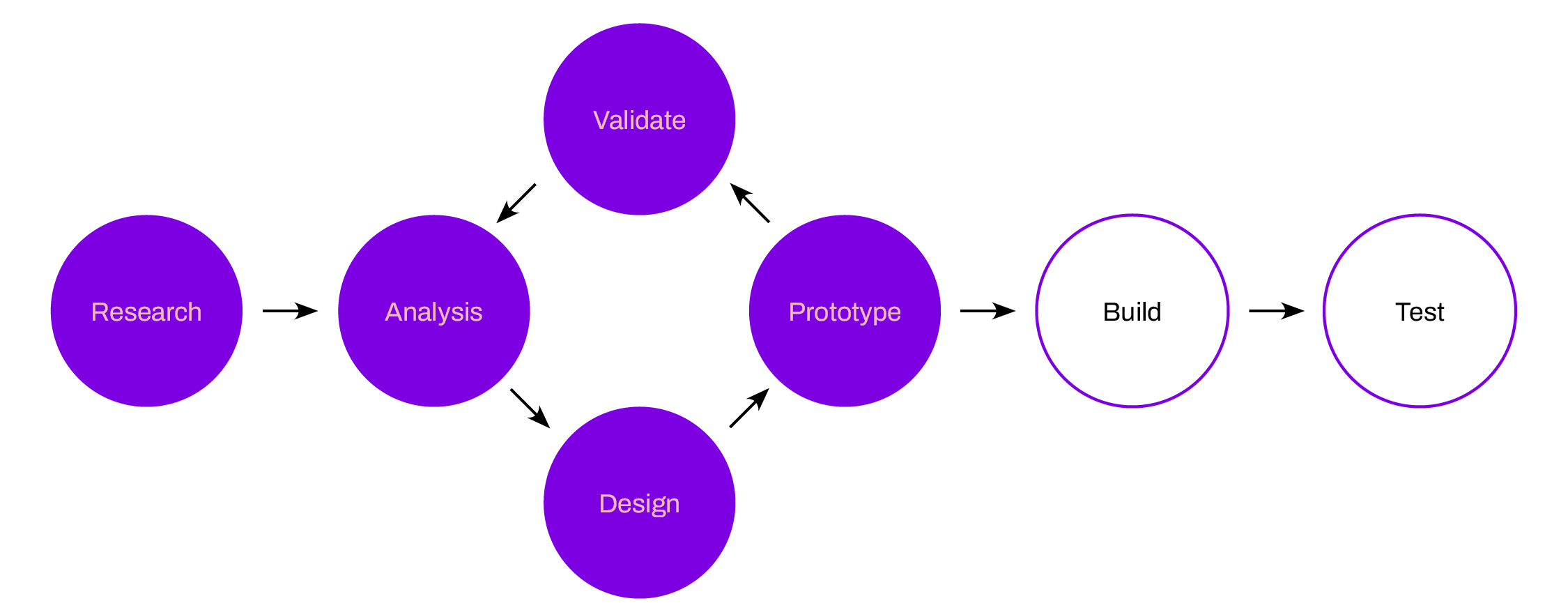
Process overview
Working as the sole UX designer, I applied a structured, user-centred design process grounded in research and validation.
The project focused on the early and mid-stages of UX, from discovery through to design refinement. While development and live usability testing were outside the project scope, I delivered a production-ready handover, including detailed wireframes and a high-fidelity interactive Figma prototype. These deliverables would be shared with developers to support implementation of a user-centred airline booking experience.
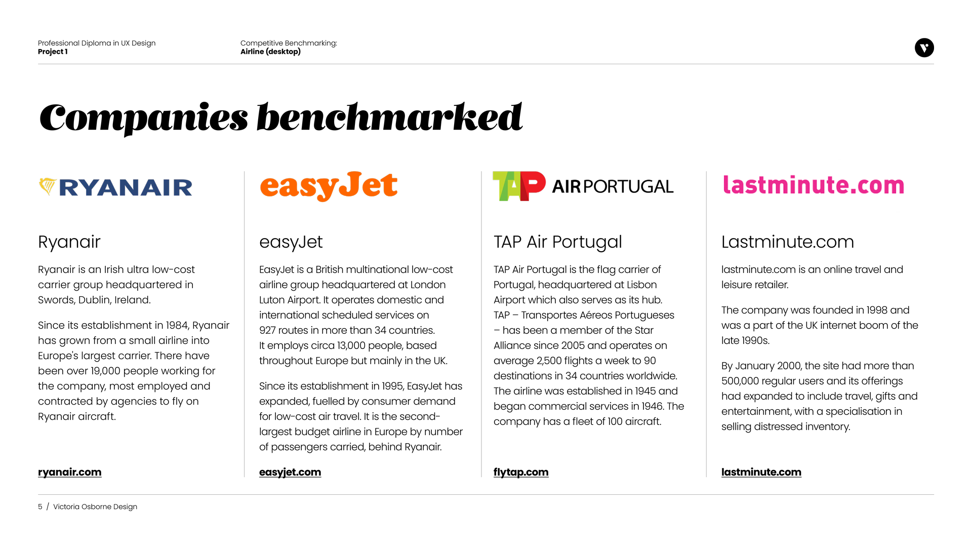
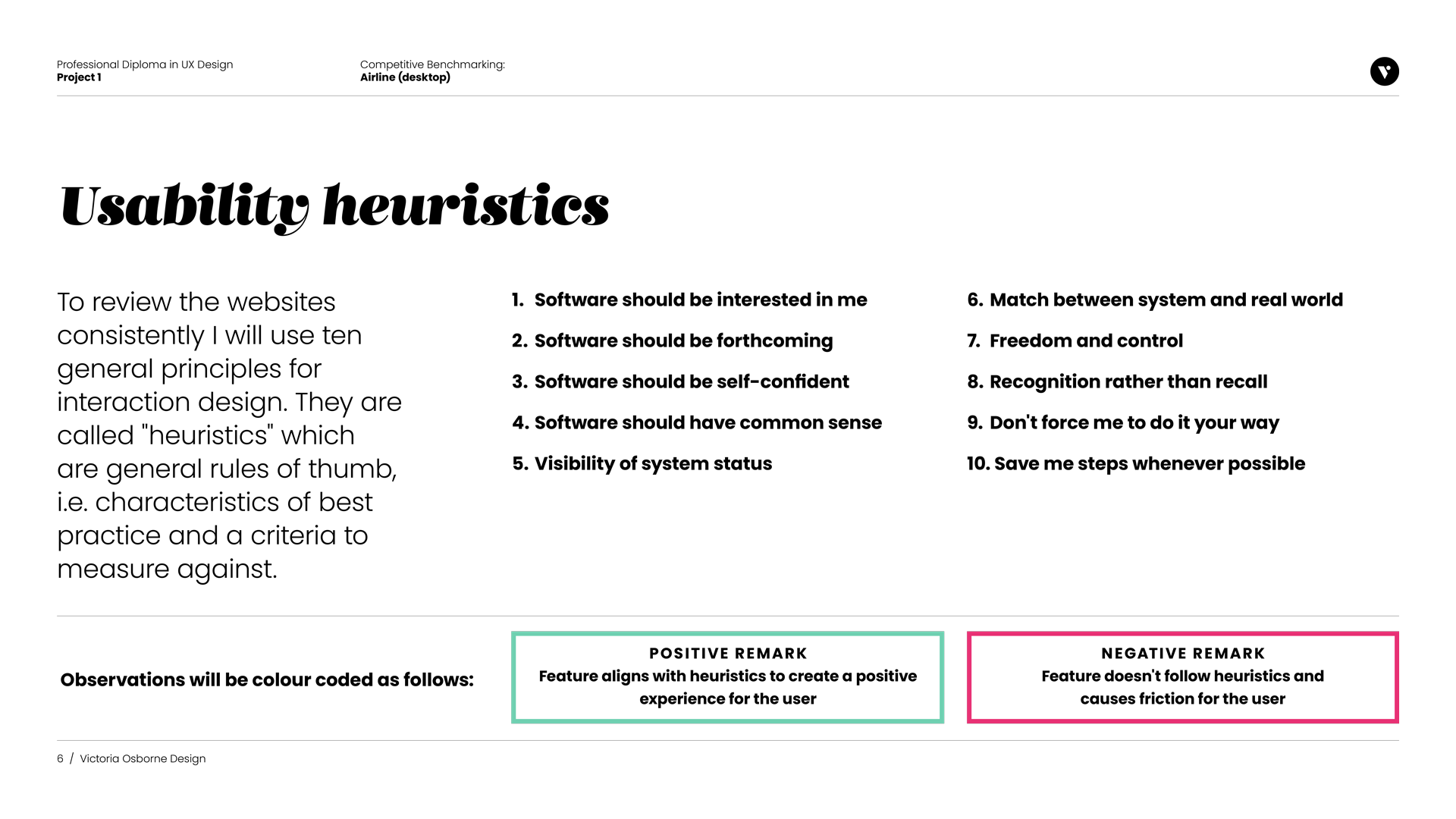
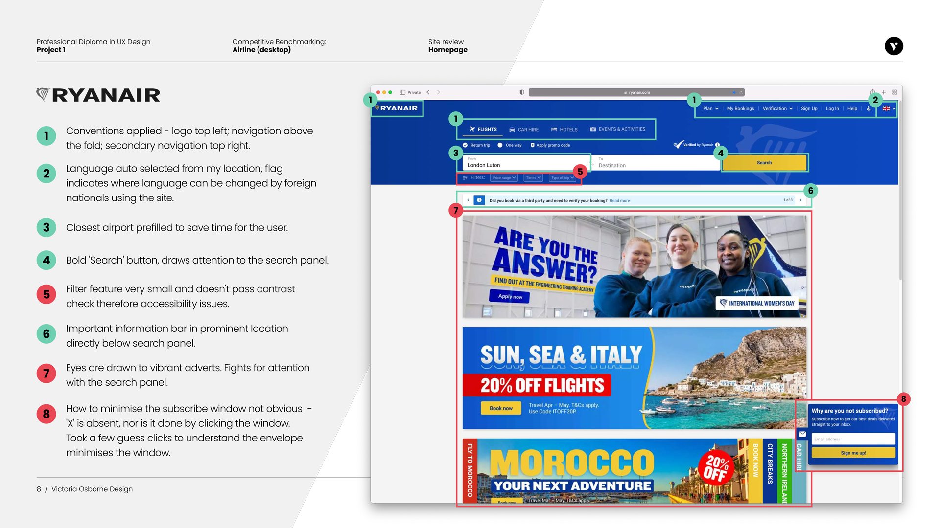
Competitive benchmarking
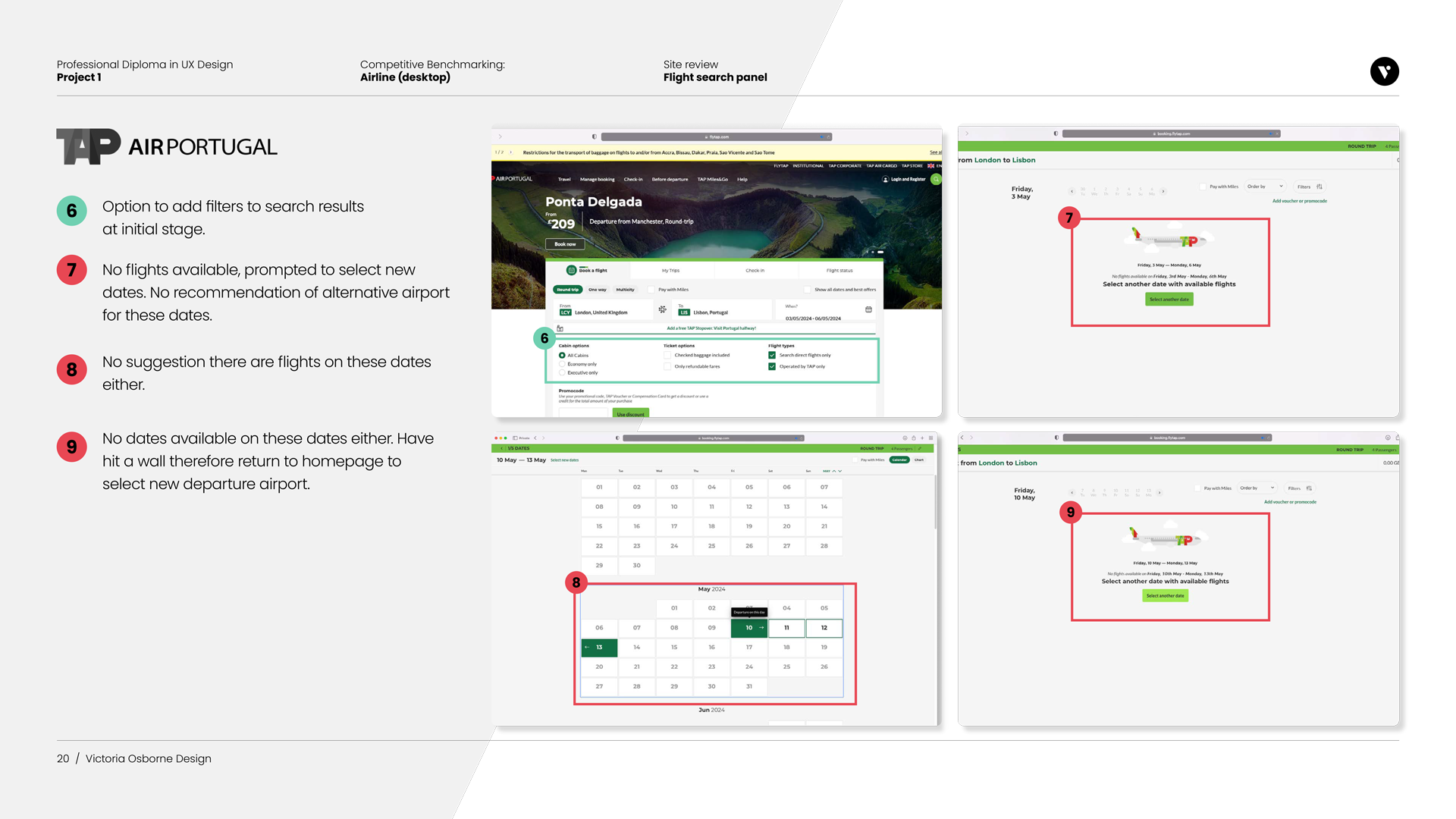
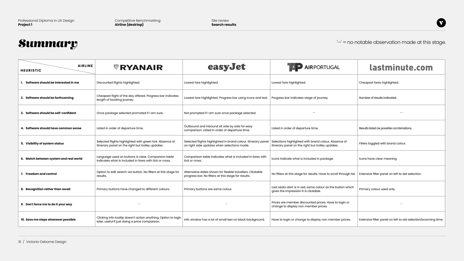
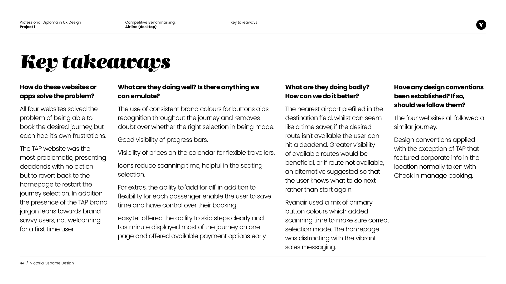
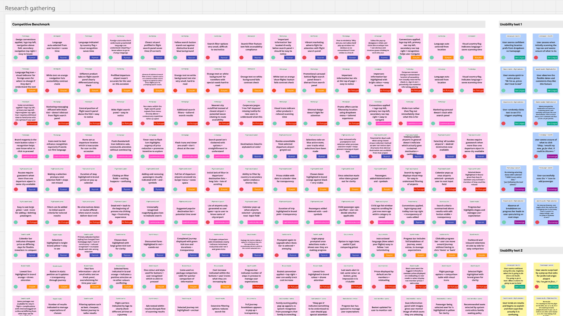
I reviewed four airline websites (Ryanair, EasyJet, TAP Air Portugal, and Lastminute.com) to identify patterns in information architecture, search flows, pricing, and error handling across the homepage, flight search, results, and extras. Using the same booking criteria and benchmarking against ten usability heuristics ensured a fair comparison and helped establish industry standards and user expectations. Key insights were summarised throughout and consolidated at the end, enabling the findings to inform evidence-based design decisions and clearly communicate UX rationale to stakeholders.
Key findings
Dead ends and jargon created friction for users.
Consistent visual cues (buttons, progress bars, icons, pricing)
improved clarity.Time-saving features and flexible extras increased user control.
A standard booking flow exists; breaking conventions caused confusion.
Research phase: Understanding Users & the Market
To design an effective airline booking experience, I began with research to build a foundation of real user needs, behaviours, and preferences.
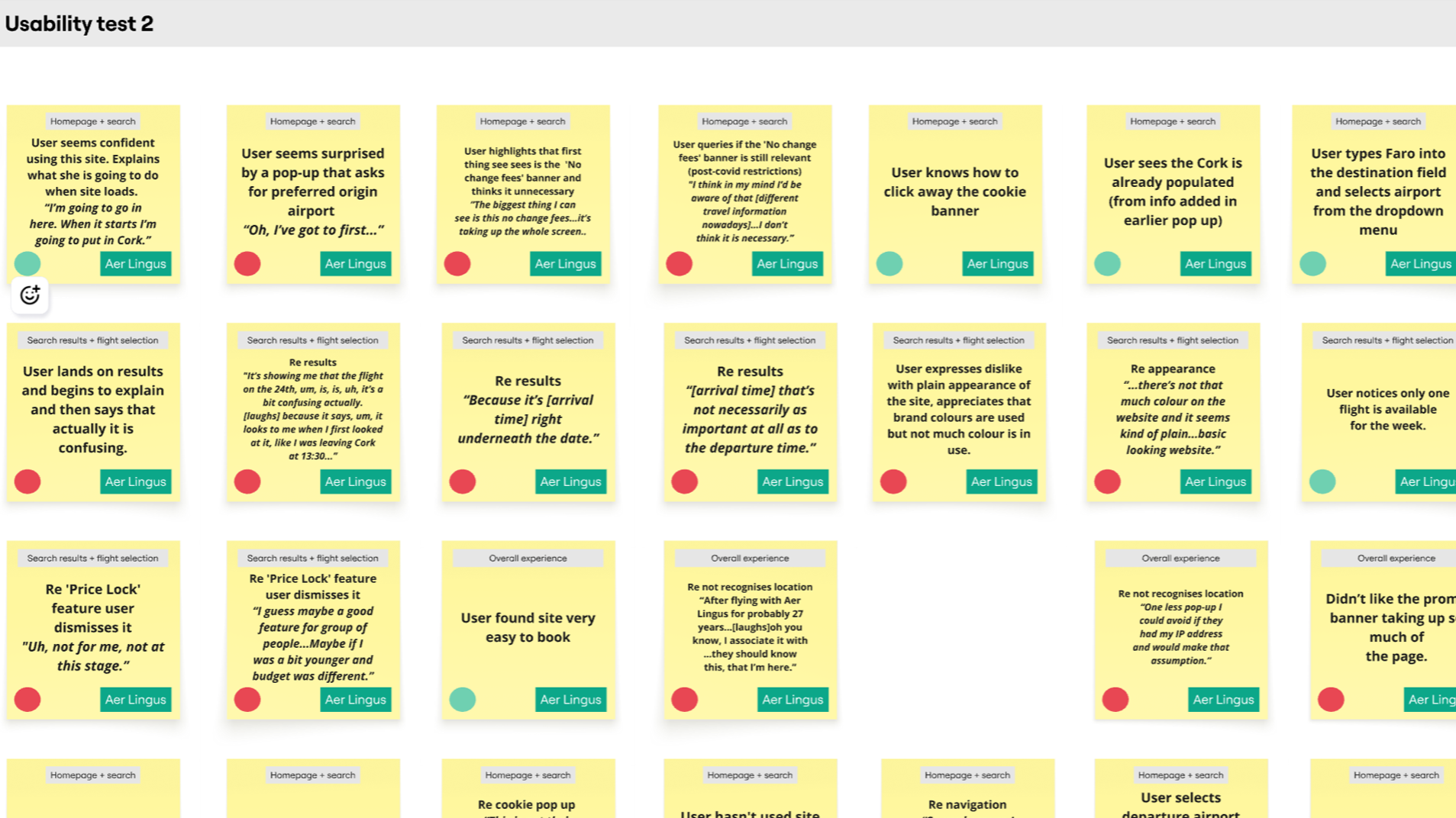
Usability tests
I conducted usability tests on EasyJet and TAP Air Portugal and reviewed prior tests on Aer Lingus and Eurowings, involving three participants across four airlines. These tests observed users’ interactions, mental models, behaviors, and pain points during the booking process.
Each test began with an in-depth interview to understand users’ goals, prior booking experiences, and typical frustrations.
Analysis phase
The next step was to analyse my findings in order to identify the most pressing user problem that needs to be solved in the design phase.
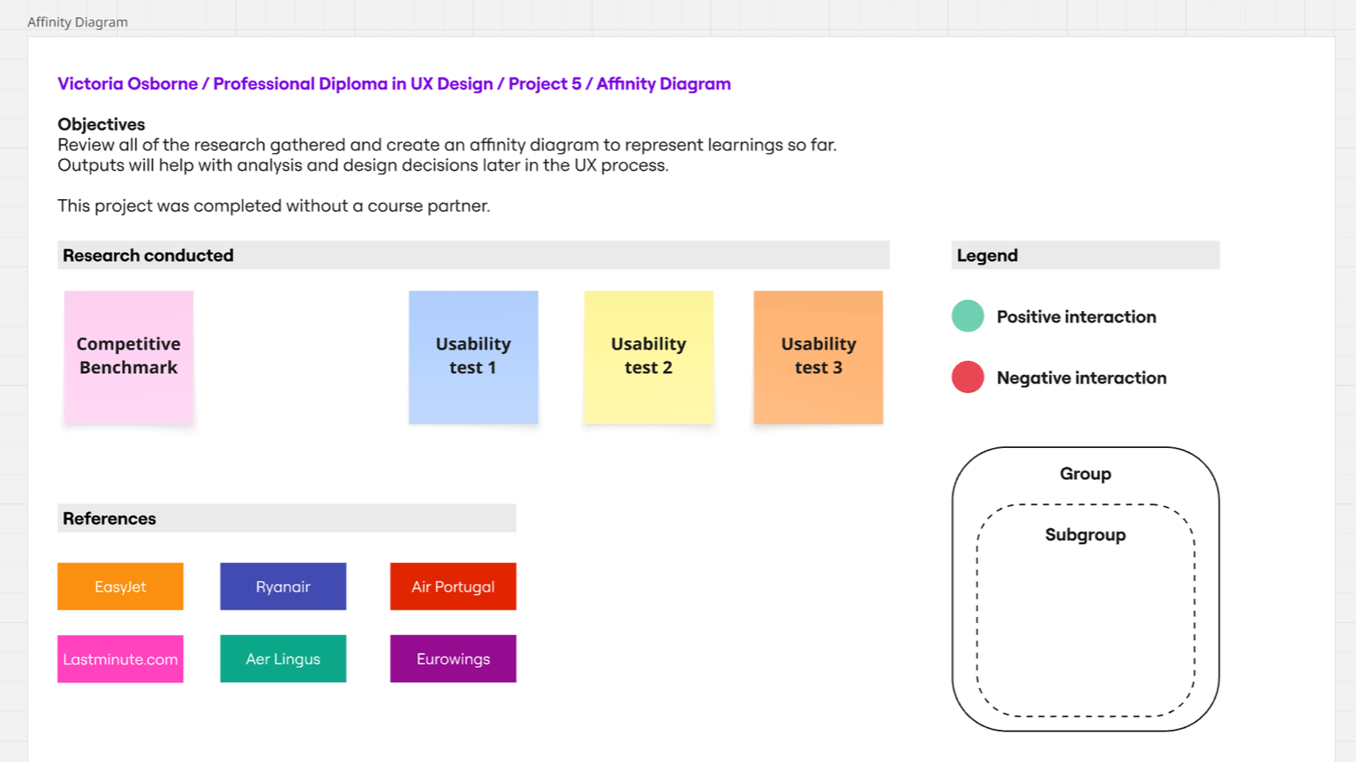
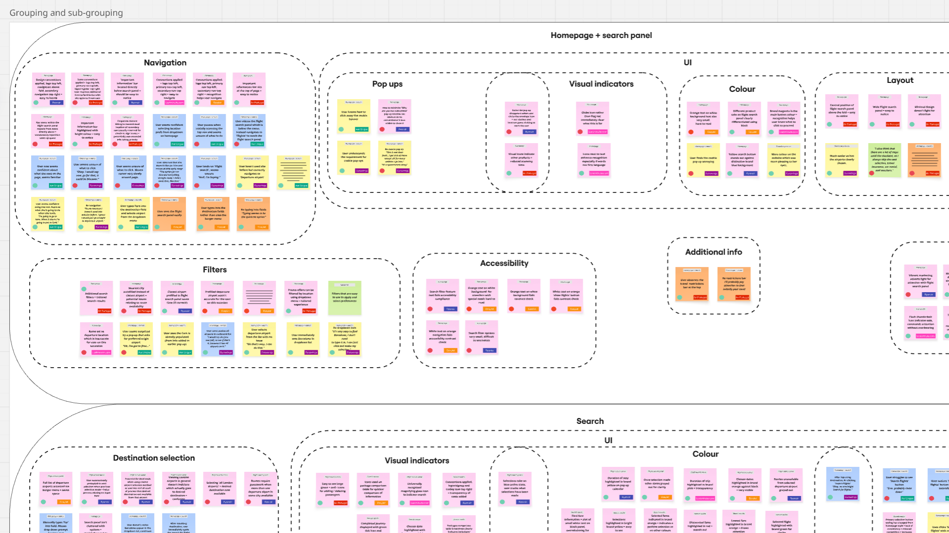
Affinity diagram
I used affinity diagramming to logically collate qualitative research data and identify recurring patterns in user behaviors, needs, and pain points. This method helped transform raw insights into clear themes that could inform design decisions. As I was the sole designer on this project I chose to use an online Miro board as opposed to physical post-it note method.
Key findings
User familiarity affects performance: Desktop vs. app experience influenced how easily users navigated sites.
Design and clarity matter: Low contrast, confusing terminology, and layout issues caused difficulties.
Helpful features need consistency: Pop-up calendars and familiar input methods were appreciated, but poor prompts or automatic selections caused errors.
Personalisation and relevance: Users preferred sites that remembered information and disliked unnecessary or unavailable options; rewards and promo features were generally ignored.
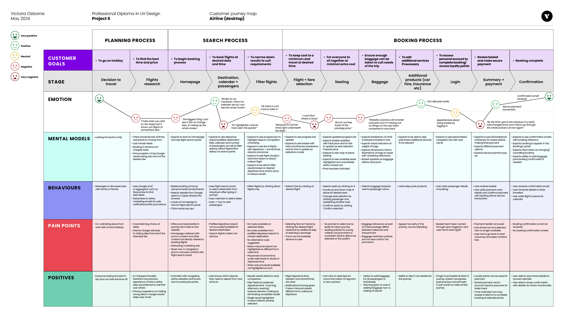
Customer journey map
I then created a customer journey map to understand how these themes played out across the end-to-end user experience. Mapping the journey highlighted key pain points, emotions, and moments of opportunity at each stage.
Together, these methods allowed me to move from raw data to actionable insights, ensuring design decisions were grounded in real user experiences.
Key findings
Clarity is key: Primary buttons should be prominent and have clear CTA.
Key travel details such as destinations and time of departure/arrival should be positioned clearly to prevent mistakes.
Confusing terminology re pricing creates uncertainty and lack of trust.
Too much information can overwhelming.
Time-saving steps such as option to auto select same baggage and seats on return journey are appreciated.
Extras deals cause irritation when they disrupt booking flow. Should appear only at appropriate step.
Losing basket at login and change of price at checkout are key pain points.
Design phase
I defined the core problem as creating a simplified booking journey that builds user trust. The experience needed to feature clear calls to action, eliminate ambiguity around next steps, maintain consistent communication throughout the journey, and include time-saving features that streamline the process without allowing extras or upselling to disrupt the primary flow.
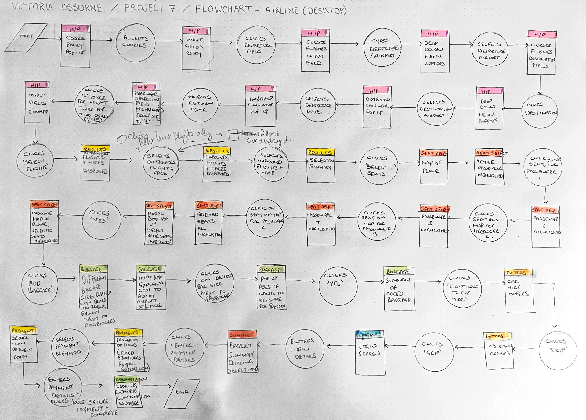
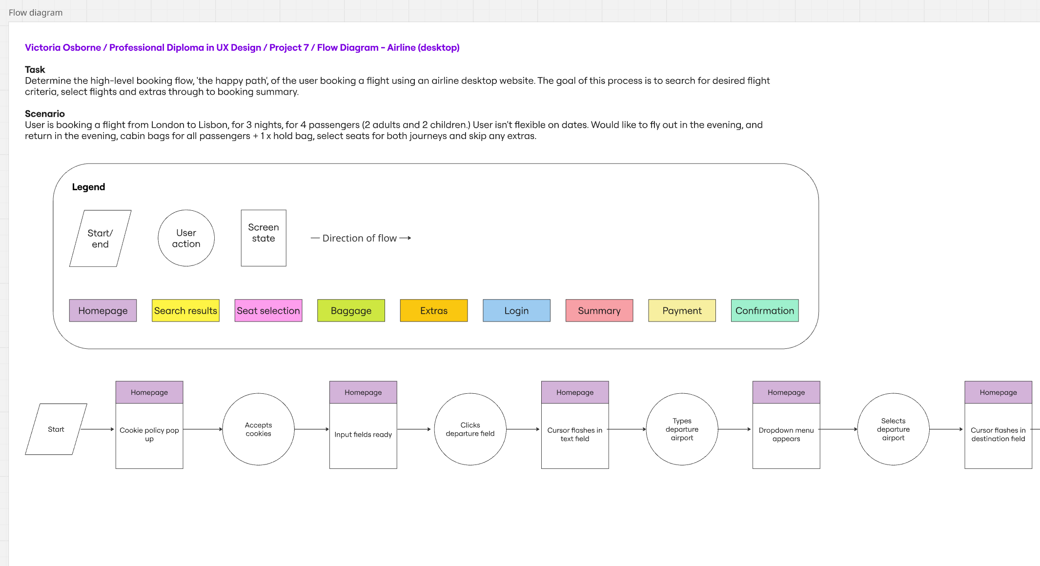
Flow diagram
The initial part was to map out user's flow through the site. This started at the homepage and finished at the booking confirmation stage. I tried to make the flow as simple as possible while addressing the pain points that were highlighted in the earlier projects.
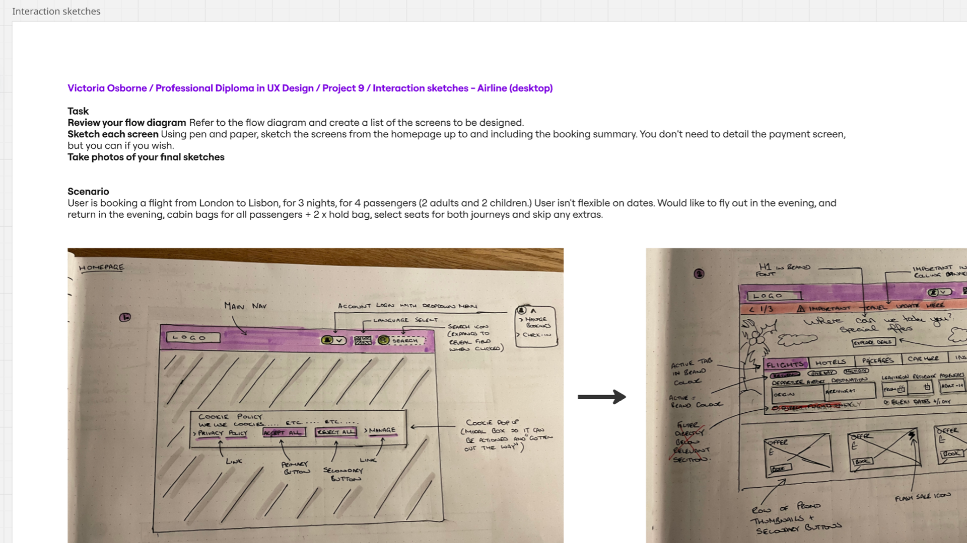
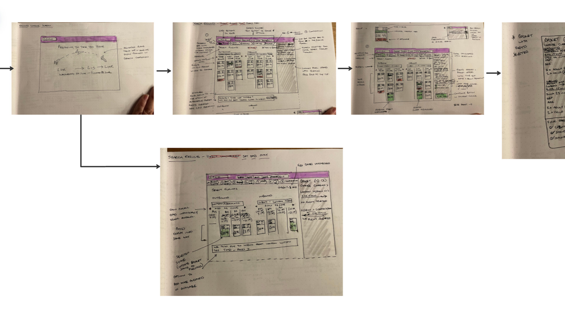
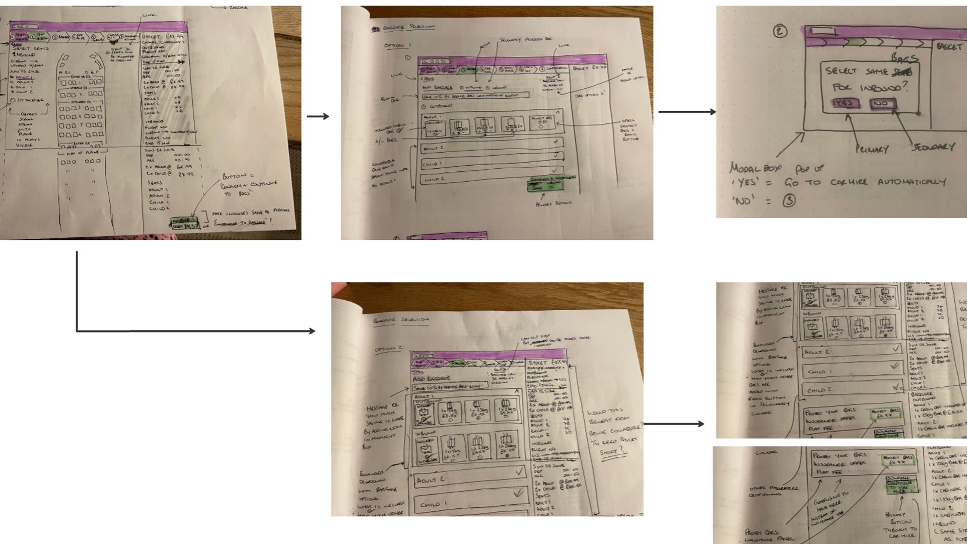
Interaction sketches
The next stage was to translate the flow diagram into annotated key screens, mapping the journey from homepage to booking summary. Sketching allowed me to explore multiple layouts and communicate the concept, which, in a real-world scenario, would save time and costs compared to jumping straight into high-fidelity tools. The focus remained on defining clear user flows and solving core problems rather than visual design.
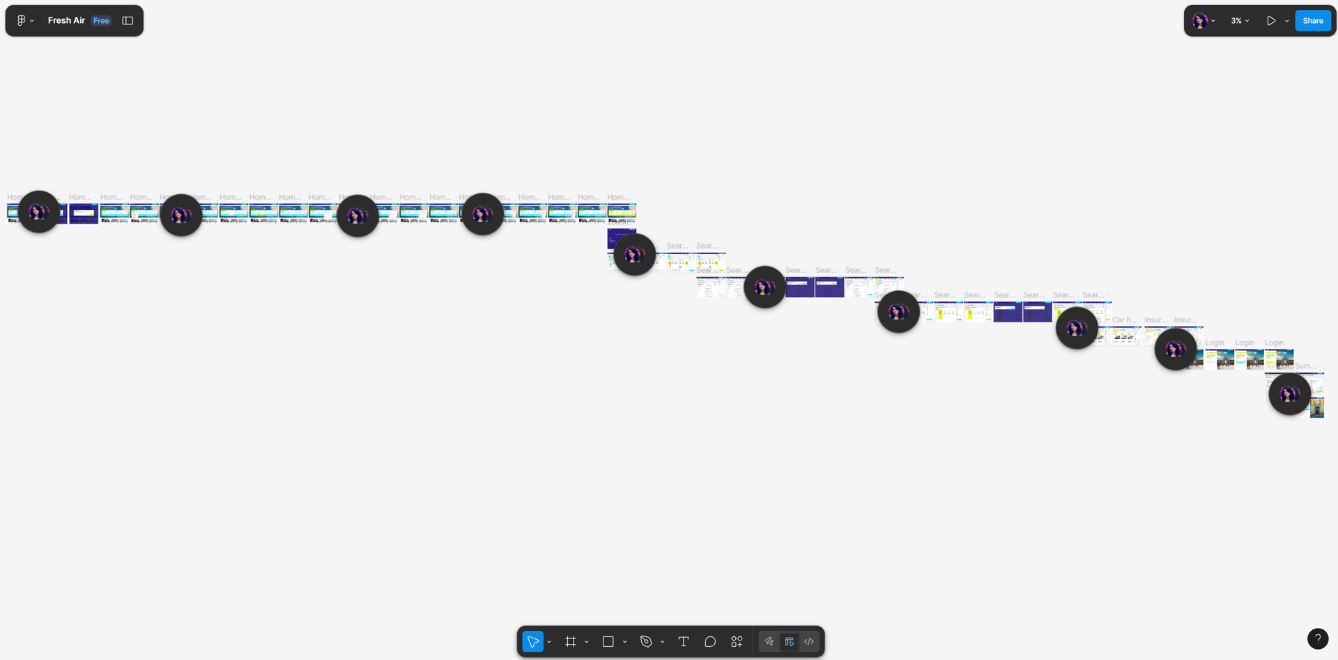
High-fidelity prototype
The next stage involved creating a high-fidelity prototype in Figma. I chose this method to bring the user flows and key screens to life with realistic interactions, visual design, and content, allowing for more accurate usability testing and stakeholder feedback. The prototype included all main screens from homepage to booking confirmation, interactive CTAs, form inputs, navigation elements, and visual cues to guide users seamlessly through the booking journey.
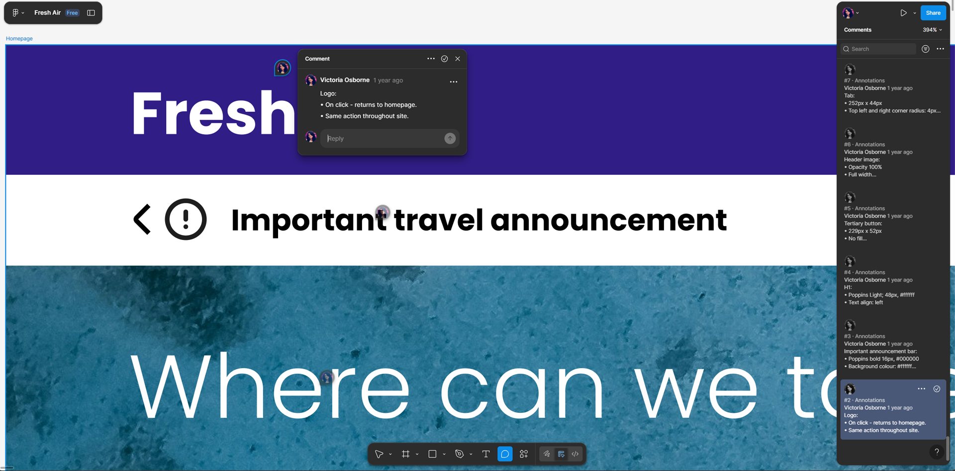
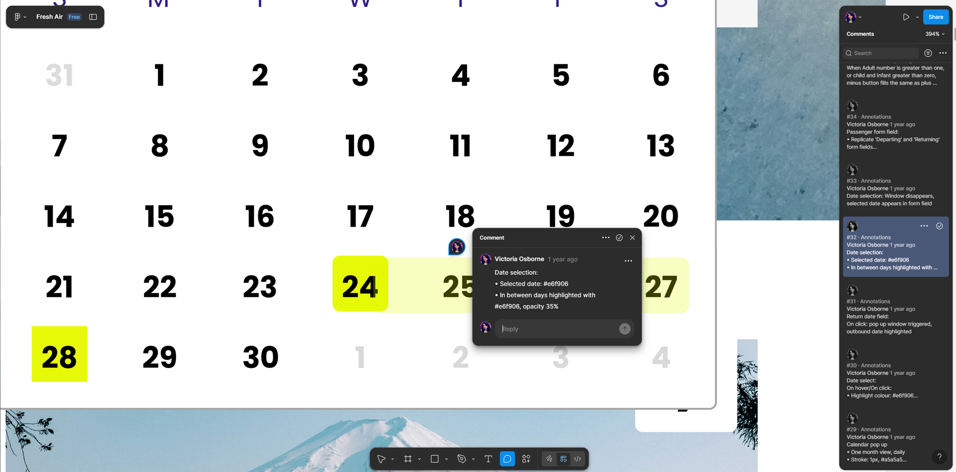
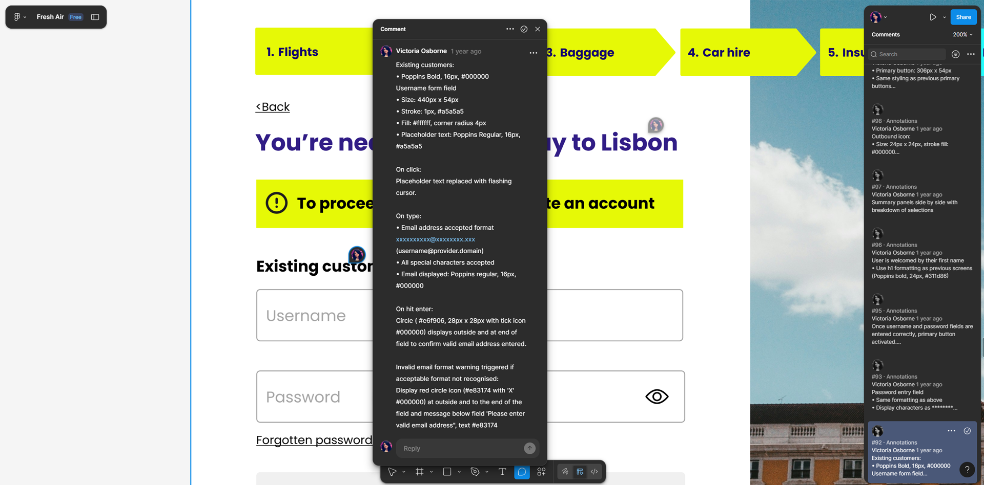
Wireframes
For the final stage of the design phase, I created annotated wireframes to support a smooth handover to developers. These wireframes included detailed notes on functionality, interactions, and design rationale, ensuring that the development team could accurately implement the user flows and interface elements. Annotating the screens helped communicate both the “what” and the “why” behind design decisions, reducing ambiguity and preventing costly misunderstandings during development.
outcome
The final outcome is a streamlined booking experience shaped by user insights and iterative design decisions made throughout the process. Research findings informed the structure, flows, and key interactions, ensuring the solution addressed real user needs while building trust and efficiency. While this project delivers a clear and considered solution, it is intended as a foundation for further usability testing and refinement, recognising that design is an ongoing, evolving process driven by continuous user feedback.