Institute of Directors
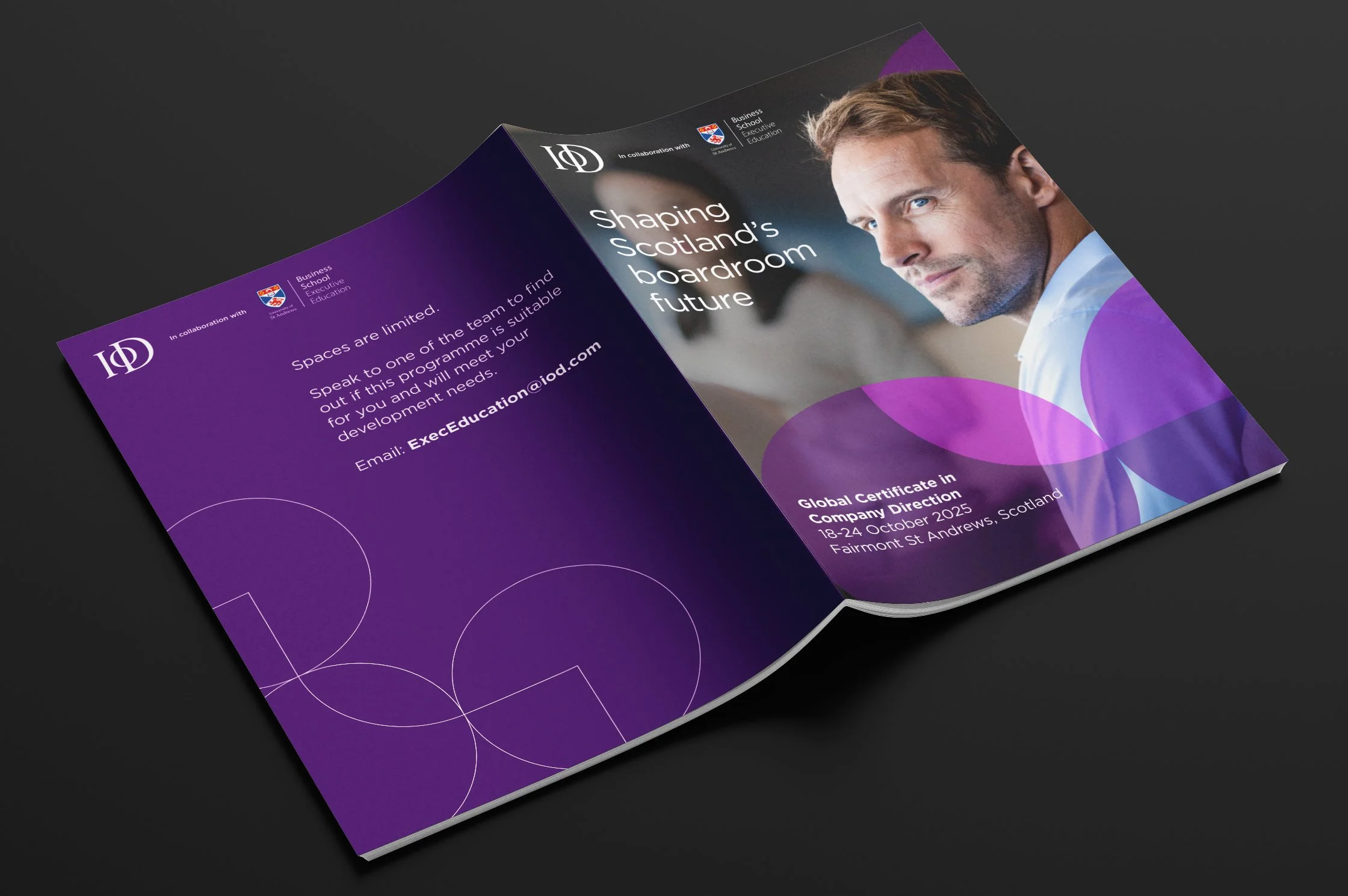
Global Certificate in Company Direction
A campaign to promote the inaugral executive education program from the Institute of Directors (IoD) and the University of St Andrews Business School that prepares directors for leadership in complex, global business environments.
brief
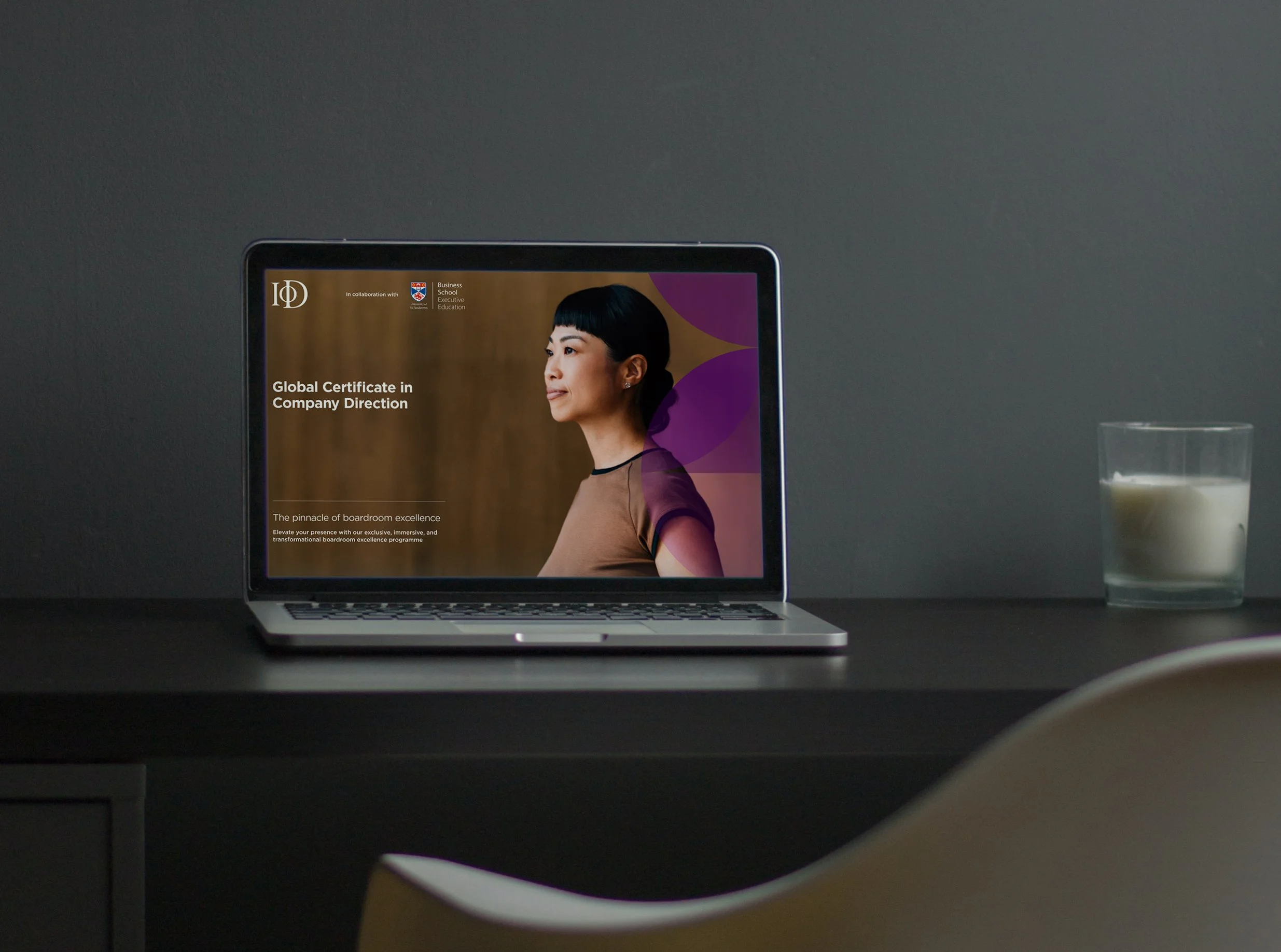
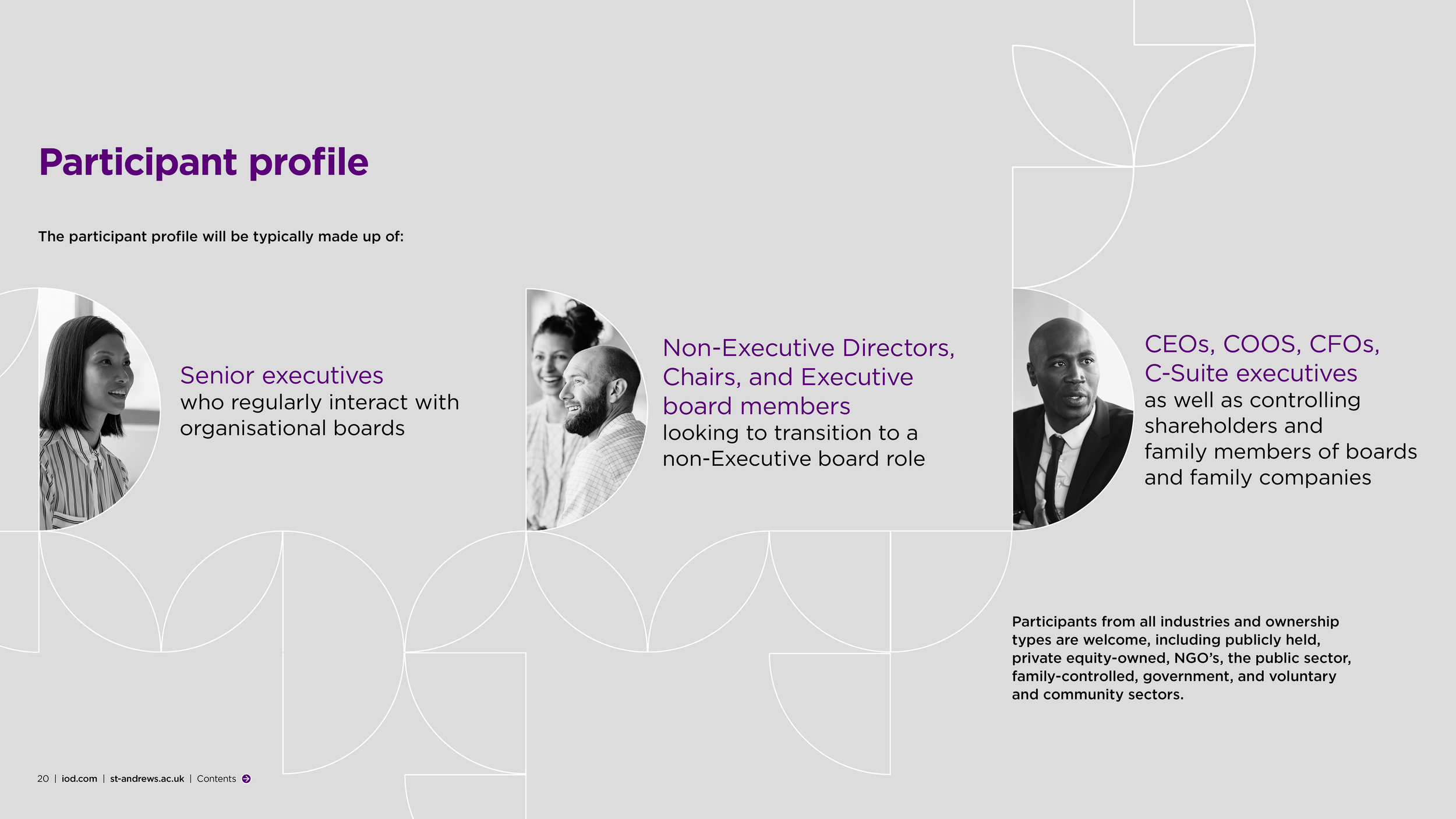
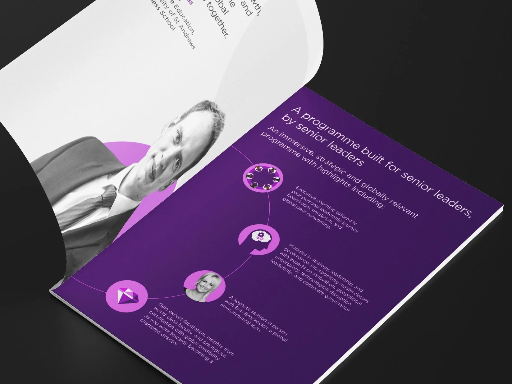
Create a digital prospectus for the inaugral IoD Global Certificate in Company Direction, a flagship qualification for senior leaders and directors. The aim was to position the programme alongside top-tier global MBAs, reflecting its international prestige and premium price point. The design needed to convey authority, exclusivity, and trust, while appealing to a discerning audience of experienced business professionals looking to elevate their leadership credentials. A key objective was to engage more women in leadership, aligning with the IoD’s mission to increase diversity within its membership and champion greater female representation at board level.

process
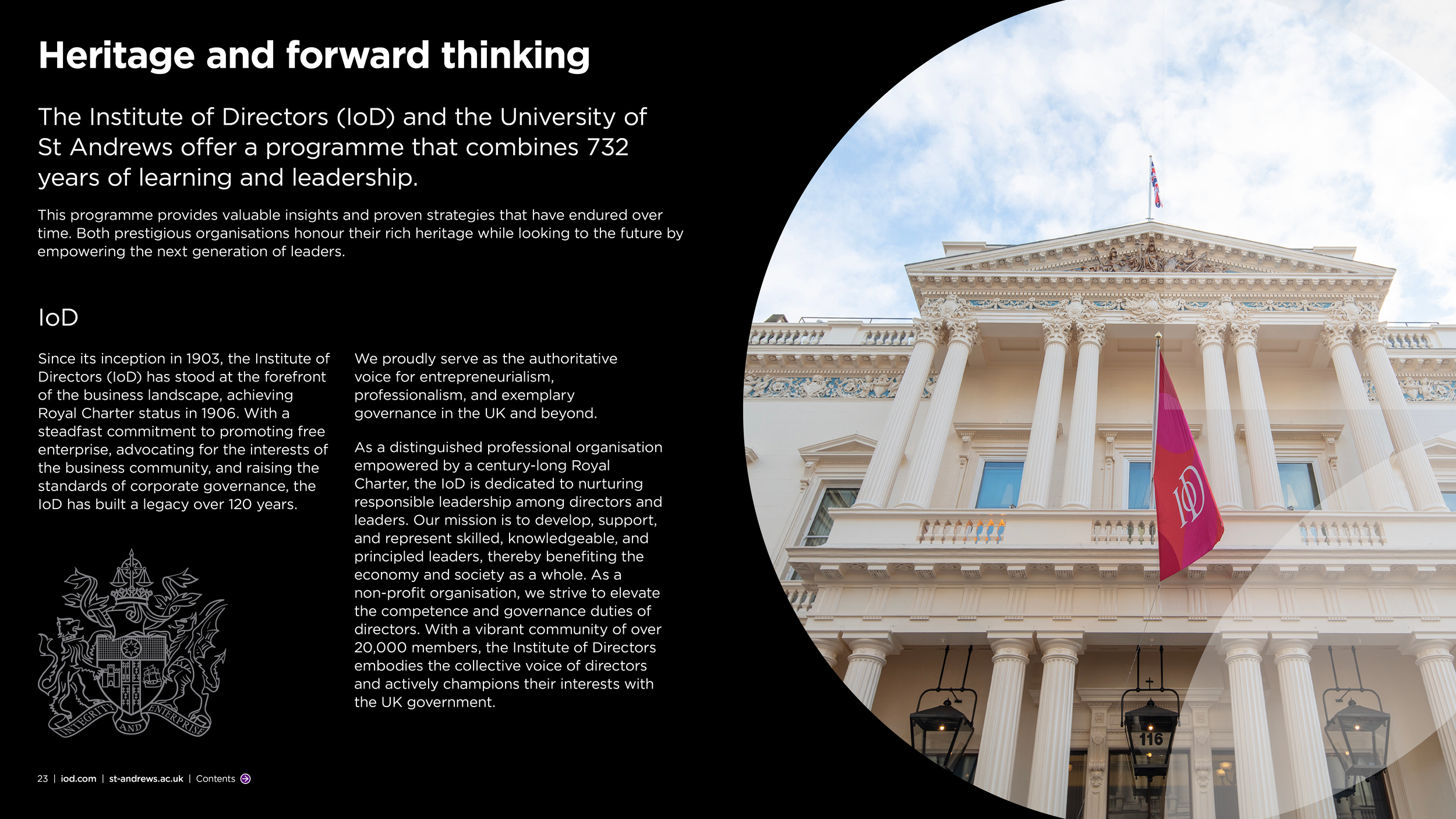
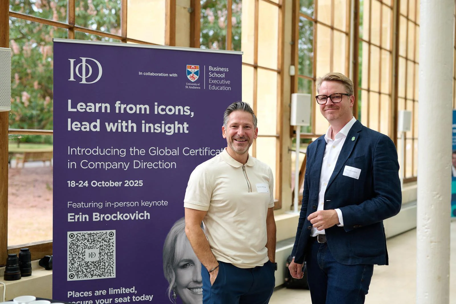
To kick off the project, I immersed myself in the University of St Andrews Business School brand to understand its tone, values, and visual language, and to identify how best to approach a confident co-brand with the IoD. The IoD Certificate in Company Direction, the foundation for the Global Certificate, features a palette of purple, blue, and orange and since purple is also one of the University’s key brand colours, it became the natural choice to lead the collaboration. This shared hue created a strong visual bridge between the two institutions while clearly distinguishing the partnership with the Business School from the wider University identity, which leans towards blue and red.
One of the main challenges was that the Global Certificate was a completely new programme, it had never been delivered before. Without existing imagery, testimonials, or real-world proof points to draw from, the creative needed to build trust and convey credibility entirely through design and messaging. Every visual and typographic decision had to work harder to project authority, prestige, and confidence while introducing something fresh and aspirational to the market.
To ensure the prospectus felt competitive among other global MBAs, I analysed design approaches from comparable programmes targeting a similar audience. From there, I curated high-end stock imagery that aligned with a premium aesthetic, introducing a balance of grayscale and colour photography to add sophistication and visual rhythm throughout the piece.
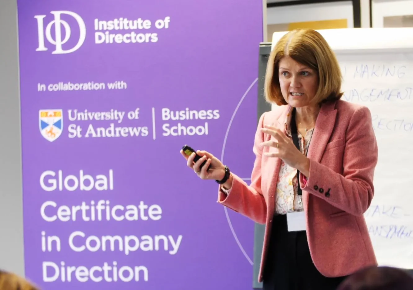
The creative direction established for the prospectus then became the foundation for all supporting materials, from marketing campaigns and digital assets to event collateral and on-programme touchpoints such as banners and signage.
© Nutkins Photography
© Mark Davies
outcome
The result was a distinctive, high-calibre identity that positioned the Global Certificate as a world-class leadership qualification. The campaign successfully captured the attention of a discerning international audience, particularly women in leadership with a fill rate of 62%, and helped reinforce the IoD’s reputation for championing excellence and diversity in professional development.